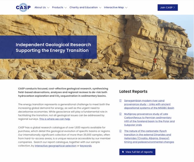
About the client
CASP is a not-for-profit charitable trust conducting field-based geological research to provide insights into key elements of sedimentary basin evolution. The origins of CASP date back to 1948 and the Cambridge Spitsbergen Expeditions. The results of their research are published in internationally renowned peer-reviewed scientific journals. They have an internationally significant collection of more than 35,000 samples, often from hard-to-access areas.
Project goals
The CASP website was over a decade old. Typically for a site of this age the design was dated, it wasn’t mobile-friendly and it was hard for users to find what they were looking for.
Goals for the redesign:
- Highlight the vast rock and fossil sample collection via an interactive map
- Provide an easy to use CMS for content editors and admins
- Improve the user experience so the site is accessible and informative for potential clients

The interactive map
CASP wanted the interactive map to wow users and attract potential new clients. It is important to show where CASP work across the globe and share the findings from their geological research. The map would enable CASP to show their collection of rock and fossil samples – this meant we would need to show more than 35,000 data points! It was our biggest and most ambitious map to date.
The map is powered by Laravel and Leaflet. Laravel and Leaflet work together to create a powerful PHP backend application to process and organise data and an interactive frontend application to display the map.
We imported the samples with their related metadata from CASP’s GIS database into our new application. The interactive map has its own CMS and users can display, manipulate and filter content intuitively.
Because there is so much data, we had to think about how to present it to users in the most accessible way.
There are three main ways for users to navigate the map:
- Clustered samples
It would not be advisable to show 35,000 entry points – from both a user experience and a website performance perspective. So, we clustered samples together – grouping samples in a general area where CASP work. Once in a general area, the user can then drill down to find specific samples.
- Zoom and pan
The user can zoom in and pan out to explore geographical locations.
- Spatial search
A spatial search allows users to draw a rectangle on the map over the area they are interested in. Data within this specific area then appears.
Once the user has reached the end point of their navigation journey, they will see details about the samples in a pop-up box, including country, sample type, material, lithology, and project details.
Some of the data presented in the pop-up is hyperlinked to the main CASP website, where the user can find context for the research. This supports CASP to continue engagement with users.
The map contained so much data that we had to plan the design carefully to ensure users could find what they needed and that the load times weren’t too long. We are extremely pleased with the user experience presented by the map.Matt Buckland, Studio 24
An easy to use CMS
Only one person was editing content on the old CASP website, but the client wanted more people involved in the editorial process. The CMS needed to be easy to use so that admins can make copy changes, upload new content, and keep the site refreshed. The old site was built in Drupal, but we built a new site in WordPress.
The CMS is used as an archive for three main types of content – reports, publications, and meetings. We took time to carefully create bespoke models in WordPress that were tailored specifically to CASP’s administration requirements.
It’s important to take the time to understand a site’s content and the pain points of its current information architecture when modelling a new content system.Carlos Eriksson, Studio 24
We created an import tool for each of the three types of content to enable admin users to easily add reports, publications, and meetings. Each content type was given custom fields based on abstracts, authors, and other content to enable admins to import content via CSV files. The content organisation was meticulously planned and well structured. Admins now have a system to import, store, showcase, and access content at the touch of a button.
By taking advantage of core CMS features, we could then also let visitors search for, export, or share their results as either CSV files or links.

Improving the user experience
We kept the design simple.
We embedded mini maps throughout the website to highlight regions or project areas and encourage users to visit the interactive map. The mini maps provide an easy way for users to move between the website and the interactive map.
Embedding maps on project pages, gives visitors a contextual entry point to the global map. So you can explore CASP’s expertise and knowledge, without being overwhelmed by a global view.Isaac Lowe, Studio 24
We showed new relationships between data so that it is clear what projects and reports contributed to what data visible on the map.
We future-proofed the website for development, which may include introducing a portal area for subscribers.
We are very pleased with the new website and interactive map Studio 24 have developed for us. It was clear from the outset that Studio 24 are leaders in designing bespoke maps for the internet and we are excited for users to explore our vast sample and report catalogue. Working with a local company was a bonus and despite the restrictions posed during the COVID pandemic we had regular contact with Studio 24’s knowledgeable team in developing our modernised, stylish and dynamic website.Simon Passey, Geoscience Data Coordinator, CASP
The outcome
The CASP website is modern, interactive, and engaging. With an exceptional user experience, users can easily find samples as well as reports, publications, and meetings. With a bespoke designed CMS, admins have everything they need to update content and effectively promote CASP’s geological research.
ContentDesignInclusive DesignSouthStrategyTechUX
Studio 24 Ltd
What we can do for you
Strategy
We help clients understand what’s possible in digital and the best way to achieve their goals. Strategy and planning is the most important part of any project. We use our expertise to guide and advise you, transforming your digital strategy into success.
– Discovery
– Project scoping
– Stakeholder workshops
– User research
– User story mapping
– User personas
– Competitor research
– Technical architecture
– Digital best practises / Web Standards
– Inclusive design / Accessibility
– Technology trends (e.g. Internet of Things, AI, bots)
Content strategy
Content is such an important part of the web, a lot of our work is the planning, creation, and delivery of content. We help you understand what content you need on your site, what communicates to your users, and what content will help you achieve your goals.
– Site audits (what’s on your site now)
– Information Architecture (what should be on your site)
– Content modelling (how we model your content in a CMS)
– Content creation planning
– Adaptive content (flexible content that can support multiple channels such as web and mobile)
– Multilingual content
– Content migration
– Accessibility audit
Design
Taking a user-centered approach to design focuses us on what really matters: your users. We design for mobile first, which means we focus on communicating your message on small screens first, then scaling up for larger screens. This helps focus on the really important content, and gives great results across any device; mobile, desktop, and in-between.
– User Experience design (UX)
– Responsive design
– Style guides / digital brand strategy
– User Interface design (UI)
– Illustration
– Interactive design and animation
– Email design
– Wireframing and prototyping
– Social Media branding
Technology
Digital technology has always been in our blood. We’ve built a wide array of digital products for our clients, including membership systems, auction sites, complex booking forms, and custom CMSs.
We’re big believers in open source, we specialise in WordPress CMS, develop custom web applications on Laravel and Symfony, and use high performance tools such as Varnish and Apache Solr.
– Content Management Systems (CMS)
– Web applications
– Database design
– PHP development
– Interactive maps (Leaflet.js, Google Maps, ESRI Maps, Ordnance Survey)
– Content migration from external systems
– API / Web Services integration
– Creating REST APIs
– Back Office integration
– Code audits
– Security
– Performance
– Improving and maintaining legacy PHP applications
Digital Marketing
Analysing, optimising and improving your digital marketing and SEO. Our Data & Content Strategist manages PPC spend to ensure your ad spend is working for you, and advises and guides on a wide range of digital marketing, SEO and content marketing topics. Our goal is to get you results.
– Digital marketing / SEO strategy
– Website analytics
– PPC management (AdWords, Facebook Ads, Twitter Ads)
– Social Media management
– Social Media audit
– Identifying key metrics (KPIs)
– Data analysis
– Technical Search Engine Optimisation (SEO)
– SEO audit
– SEO keyword analysis
– International SEO
Support
We have a dedicated team to help manage support for our clients, which is backed up by the studio development team. For those clients with critical support requirements we offer 24/7 out of hours support to respond to any critical issues with your site.
Hosting & Domains
You need a place for your website or application to live on the internet so it can be accessed by your users. We’ve managed hosting for our clients for over 18 years, from simple affordable cloud servers to multi-server, high availability hosting spread across multiple data centers. We’ve been a Rackspace partner for over a decade, we offer cloud and dedicated hosting backed up by Rackspace’s expert engineers. We host on Amazon Web Services (AWS) and Rackspace Cloud. We also manage domains and SSLs on behalf of our customers, taking the complexity out of digital.
What don’t we do?
We specialise in digital, so we don’t offer print or branding design. We can, however, interpret and develop your brand on digital. Our focus is on the open source UNIX technology stack, PHP is our specialist programming language along with HTML/CSS/JavaScript. When required we work with trusted partners to provide specialised services (e.g. enterprise search, photography, video).
Visit profile

